painter with paintbrush up

Arty bollocks

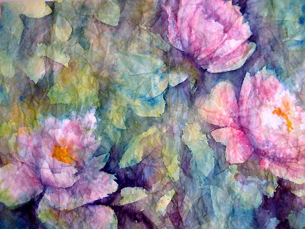
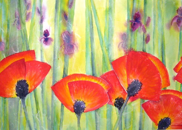
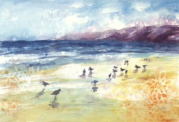
I had a great time in art school. Loved my classes, loved my teachers, loved being around art all the time. Especially loved learning new techniques and just being free to make things - all the time. It was fabulous.

I only had one problem - other artists.

Don't get me wrong - not ALL other artists. In fact most artists are pretty fabulous. But there were the ones - you know who I'm talking about - the ones who give the rest of us a bad name. The "arTEESTs". The proverbial beret and black turtleneck-wearing, mumbo-jumbo talking, flighty and irresponsible, look-down-their-nose-at-you-for-not-getting-it, art jerks. This is the kind of guy who would wear a cape or even carry a cane. Seriously.

There were a few of them in my classes and at least the ones I've met in person were not actually very good artists. But they definitely thought they were. And what they had going for them is the ability to TALK about their art. In high-falutin' terms. Ad nauseum. They talk so long and in seemingly spiraling circles that you lose track of what they're saying and stand there dumbly nodding wondering if you're the idiot or if they're really so up their own behinds that they forgot that their discourse needs to actually make sense at some point.

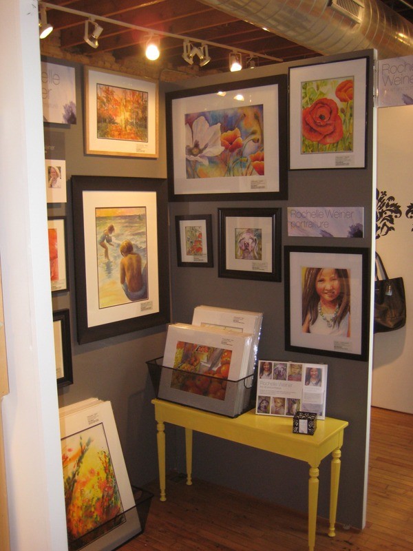
Problem is, I could really use one of these guys about now. I'm set with the daunting task of writing the proverbial "artist's statement". It is my goal to get into some galleries this summer and one of the things I need to prepare is this statement. When I've looked online for some samples of what these should sound like, I have to say I haven't the slightest how to begin.

I think most artists actually do have trouble putting into words all that they mean in their art. Artists in general are visual thinkers and to try to translate feelings into words seems an insurmountable task. And why bother? After all, your art should speak for itself, right? Wrong. The artist's statement is actually a really important part of selling yourself first to a gallery owner and then to art buyers as well. It is the background about who you are as an artist, what you have to offer the world and how your message can be interpreted. It is very important to get this right. I get it. I just don't know if I'm up to the job.

If you've read much of my blog you will see that I'm pretty straightforward in my communications. I don't go on for ages using esoteric language and citing obscure allusions... I simply write what I'm thinking in regular everyday language. These artist statements are lengthy discourses on influences, reminiscences, philosophies, experiences, social relevance, aspirations, etc. and peppered with so much fluff-talk that the whole exercise seriously makes me want to run the other way.

My good friend Kelly just sent me this link, "Arty Bollocks Generator" which I thought was totally hilarious! I'm thinking seriously of using it, or at least using it as a jumping off point! Just click the button and up pops an artist statement. Chock-full of the high-falutin' talk for which these statements are seemingly known.

Ugh. Well, wish me luck. My guess is my artist's statement will turn out much like the rest of what I write. Concise and informative, and hopefully somewhat interesting or amusing. I just hope it does the trick! Stay tuned!

IMG_4127

The beauty of wrinkles

Crinkled masa paper plus watercolor provides some interesting effects.

I've done 4 paintings now, experimenting with this technique, and I have to say I'm really liking the effects you can get. The peonies pictured below turned out really soft and transparent-looking. Almost as if I'd used layers of colored tissue paper to make the image. (Hey - that's another interesting idea!)

Crinkled masa paper - Irises in a field

Crinkled masa paper - "Irises in a field"

The irises pictured above have a different feel - almost diffused, or impressionistic. For the irises I painted on the back side of the masa paper, which has a slightly fuzzy texture. This would be the explanation for the diffused effect of the painting overall.

Crinkled masa paper - Spring tulips

Crinkled masa paper - "Spring tulips"

The tulips are another idea again - the spread of color into the background gives a feeling of movement that I wasn't expecting. All in all, a fun exercise and I like the experimentation!

FinnIrises

Masa paper - the crinkle technique

Inspired by Chinese artist, Cheng-Khee Chee, I've been experimenting with the masa paper crinkle technique. It involves soaking masa paper in water and balling it up into a crinkled mass. This step breaks the sizing in the paper and when you smooth it out it's left with a network of broken crinkle lines. When you paint into it the color seeps into the cracks enhancing the delicate lines.

Row of trees - masa paper crinkle technique

Chee did a lot of paintings of woods and trees using this technique. The cracks easily translate into tiny branches and woodsy textures.

My first try became a painting which I called "Row of trees". It's a small painting, about 8" x 10". I've already sold two prints of this painting at the Galleria, so I have decided to give it another go.

I started a large painting the other day, 31" x 21" sheet of masa paper, inspired by a beautiful blue iris garden I photographed over the weekend. From what I was reading about masa paper you can either paint on the smooth, shiny side of the paper, or on the slightly fuzzy backside. For this one I decided to go with the back as I like the texture.

I started with Ultramarine Blue for the flowers, creating the initial shapes of the composition by dropping the paint right into the very wet paper. The color fanned out beautifully, running up into the newly-created crinkles in the masa paper. Painting into wet paper is one of those techniques where you have to embrace the unexpected. You can't control where the color will go - you put it where you want it and then go with the flow.  In this case I think it's a nice start.

I kept moving, adding in lots of Aureolin Yellow and Antwerp Blue in the background, in layers of uneven color to get some modulation in tone. I added some Permanent Magenta to the flowers to give them some depth, careful to leave whites where I could. Then I left it to dry. When I came back in I started adding harder edged areas of grasses and stalks, being sure to soften them here and there. I also added more ultramarine blue to the petals to start building up definition.

It's going in a good direction, but I don't think it's quite done yet. Next step is to flatten the painting. Methods I've read about include gluing the masa to a backing sheet, flattening with a brayer as I go. I like working with the lighter weight paper though, so I think I'll try dampening it and putting a warm iron to the back side and see where that gets me. Once it's flat I'll continue adding sharper details to the foreground and a bit to the midground. I think I'll leave the back row of flowers soft to enhance depth in the final composition.

Above - my cat Finnegan was having a close look, and I think he agrees it needs more work.

abstractpoppies

Gallery night - woohoo!

Thank you to everyone who showed up on Friday night (June 3), for my official opening at the Andersonville Galleria. All my Chicago people turned up, even the driving in from the far suburbs, and my family also made it down from Milwaukee - yay! What a fabulous turn out!

This was my first attendance at the Galleria's monthly "First Friday" event - and what a load of fun! Wine is served (and I put out some snacks) and they stay open until 10pm. The weather was wonderful and the gallery was packed and everyone had a wonderful time.

The following prints were snapped up that night - thank you to all for your support!

[nggallery id=8]

BirdsonBeach-sm

I have a fan in Arizona!

What a thrill! I was just at the Andersonville Galleria preparing a new painting for exhibit and was lucky enough to meet a new fan!

Row of Trees

Row of Trees

She is a lovely woman from Arizona visiting her daughter here in Chicago. She purchased two of my prints... "Row of trees" and "Birds on beach". She was really nice and very complimentary about my work. I shook her hand and asked if I could take her with me wherever I go.

Very exciting! I now have a fan in Arizona!

I wish I'd have had the presence of mind to get her name and take her picture... I'll have to do better next time. But at least I made sure she didn't leave without my business card. I'll just have to hope she emails me or maybe shows up on my website and posts a comment.

Before she left she said "Don't stop! I love pretty!" Thank you, fan in Arizona - you made my day!

Algae-sm

Yupo, my friend

I am having a love affair with Yupo paper.

This paper is used in commercial printing and is actually a kind of plastic. This means it does not soak up water so a watercolor painting sits on top of the page and dries only when the water evaporates.

I'm working on a few different techniques, but so far I am having luck with a mixture of loads of paint, little water, plastic wrap for texture and sprinkles of sea salt.

The plastic wrap put on wet paint creates some very interesting and unexpected shapes. You can either let it dry (takes ages) and then remove the plastic... or you can remove it while the paint is still wet. The painting showed uses the latter technique. What I like about it is the unexpected swooshes of color mixes that you get by removing the sopping wet plastic wrap. Then while it's still super wet I throw on some salt and let it set for a while. I come back when it's partially dry and work in more wet color and then pick up the sides of the paper and allow it to drip across the page creating rivulets of color.

This one, once it was finished, really reminded me of a growing thing - moss or algae or maybe something seen at a molecular level. I decided to title it "Algae".

I really think this style and techniqe has potential for some amazing large scale paintings... stay tuned!

Pictured above, "Algae".

PeonyDrama-sm

Fruits of my trespass

PeonieProfile-sm

Peony in profile

Okay! so I trespassed and I painted and here are the fruits of my activity (illegal?)

Both peony paintings are a combination of collage and watercolor... a technique I learned from Karlyn Holman that I've been having a lot of fun with.

The peonies in real life have such a delicate and lush presence, I was trying to achieve that in my paintings. I think the finished works look a lot more hard-edged than the actual flowers but I like the slight feeling of transparency to the petals and the drama I was able to add with the intensity of color.

The collaged paper I think adds a random quality that really appeals to me - and dirties up the painting a bit too. I don't try to achieve perfection in my paintings . I prefer to be pulled in random directions depending on how the paint is flowing on the sheet. You never know what you're going to get... isn't that exciting?

Ok, I trespassed

Love this image - painting to follow soon!

Love this image - painting to follow soon!

I admit it. I trespassed into my neighbors yard today. I seriously couldn't help myself.

Everyday, I sit in my office working at my computer, and my view out the window is of the homes across the street. Lately, I've been distracted by the most amazing peony bush that seems to have sprouted overnight next to my neighbor's front steps. That bush is literally drooping with these wonderful, heavy, huge pink blooms. I had to run across the street, camera in hand, hoping not to get caught out.

I have always enjoyed taking photos, particularly since digital cameras came on the scene. I love that I can capture images and see the result immediately (yes, I do struggle daily with the lure of instant gratification). But this year since I've began painting in earnest, my camera is always in my bag. I love to stop and grab shots whenever I see something that interests me, and then I go home and paint it. I think nothing of stopping the car on the highway to snap that perfect shot of a sunset or a beautiful view, and yes trespassing into a yard to get a close up of a beautiful garden. This morning, that inspiration presented itself in my neighbor's yard.

So - very sorry neighbor - but it's for a good cause! the cause of art! (See finished paintings here.)

Left side of booth

Now showing at the Andersonville Galleria

I have taken a booth at the Andersonville Galleria in Chicago. My paintings and prints are on display on the 2nd floor. I took some time and painted the booth and created some signage and installed it all a couple weeks ago with the help of my friend Sandy. So exciting!

RO

Sign up for the mailing list.

©2024 Rochelle Weiner Carr Fine Art, All Rights Reserved