IMG_4129

Cray pas and watercolor? huh?

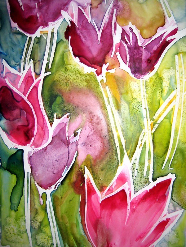
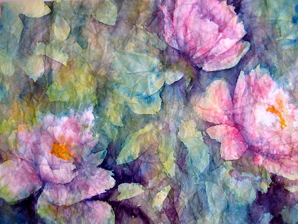
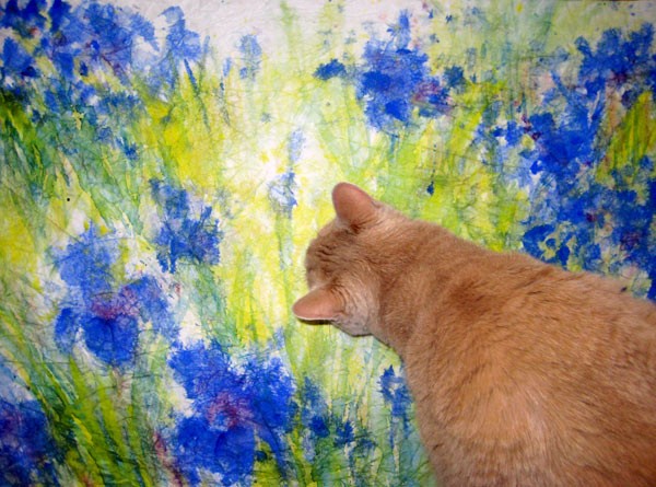
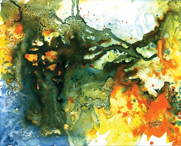
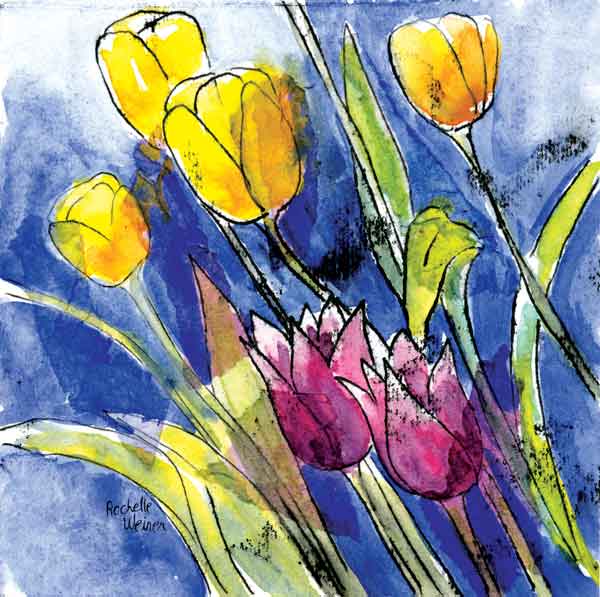
I had an idea last week - why not mix cray pas with watercolor? Oil and water could create unexpected and hopefully very cool results.

So, I tried drawing different images and lines on different kinds of paper and then painted watercolor on to it. The oily lines repelled the wet paint and retained the integrity of the lines. Dig it!

This concept allows for some really free design and color applications. Just getting started with the idea so the below are basically tests and experiments, but I have to say, I see endless possibilities!

[nggallery id=9]

IMG_4127

The beauty of wrinkles

Crinkled masa paper plus watercolor provides some interesting effects.

I've done 4 paintings now, experimenting with this technique, and I have to say I'm really liking the effects you can get. The peonies pictured below turned out really soft and transparent-looking. Almost as if I'd used layers of colored tissue paper to make the image. (Hey - that's another interesting idea!)

Crinkled masa paper - Irises in a field

Crinkled masa paper - "Irises in a field"

The irises pictured above have a different feel - almost diffused, or impressionistic. For the irises I painted on the back side of the masa paper, which has a slightly fuzzy texture. This would be the explanation for the diffused effect of the painting overall.

Crinkled masa paper - Spring tulips

Crinkled masa paper - "Spring tulips"

The tulips are another idea again - the spread of color into the background gives a feeling of movement that I wasn't expecting. All in all, a fun exercise and I like the experimentation!

FinnIrises

Masa paper - the crinkle technique

Inspired by Chinese artist, Cheng-Khee Chee, I've been experimenting with the masa paper crinkle technique. It involves soaking masa paper in water and balling it up into a crinkled mass. This step breaks the sizing in the paper and when you smooth it out it's left with a network of broken crinkle lines. When you paint into it the color seeps into the cracks enhancing the delicate lines.

Row of trees - masa paper crinkle technique

Chee did a lot of paintings of woods and trees using this technique. The cracks easily translate into tiny branches and woodsy textures.

My first try became a painting which I called "Row of trees". It's a small painting, about 8" x 10". I've already sold two prints of this painting at the Galleria, so I have decided to give it another go.

I started a large painting the other day, 31" x 21" sheet of masa paper, inspired by a beautiful blue iris garden I photographed over the weekend. From what I was reading about masa paper you can either paint on the smooth, shiny side of the paper, or on the slightly fuzzy backside. For this one I decided to go with the back as I like the texture.

I started with Ultramarine Blue for the flowers, creating the initial shapes of the composition by dropping the paint right into the very wet paper. The color fanned out beautifully, running up into the newly-created crinkles in the masa paper. Painting into wet paper is one of those techniques where you have to embrace the unexpected. You can't control where the color will go - you put it where you want it and then go with the flow.  In this case I think it's a nice start.

I kept moving, adding in lots of Aureolin Yellow and Antwerp Blue in the background, in layers of uneven color to get some modulation in tone. I added some Permanent Magenta to the flowers to give them some depth, careful to leave whites where I could. Then I left it to dry. When I came back in I started adding harder edged areas of grasses and stalks, being sure to soften them here and there. I also added more ultramarine blue to the petals to start building up definition.

It's going in a good direction, but I don't think it's quite done yet. Next step is to flatten the painting. Methods I've read about include gluing the masa to a backing sheet, flattening with a brayer as I go. I like working with the lighter weight paper though, so I think I'll try dampening it and putting a warm iron to the back side and see where that gets me. Once it's flat I'll continue adding sharper details to the foreground and a bit to the midground. I think I'll leave the back row of flowers soft to enhance depth in the final composition.

Above - my cat Finnegan was having a close look, and I think he agrees it needs more work.

Algae-sm

Yupo, my friend

I am having a love affair with Yupo paper.

This paper is used in commercial printing and is actually a kind of plastic. This means it does not soak up water so a watercolor painting sits on top of the page and dries only when the water evaporates.

I'm working on a few different techniques, but so far I am having luck with a mixture of loads of paint, little water, plastic wrap for texture and sprinkles of sea salt.

The plastic wrap put on wet paint creates some very interesting and unexpected shapes. You can either let it dry (takes ages) and then remove the plastic... or you can remove it while the paint is still wet. The painting showed uses the latter technique. What I like about it is the unexpected swooshes of color mixes that you get by removing the sopping wet plastic wrap. Then while it's still super wet I throw on some salt and let it set for a while. I come back when it's partially dry and work in more wet color and then pick up the sides of the paper and allow it to drip across the page creating rivulets of color.

This one, once it was finished, really reminded me of a growing thing - moss or algae or maybe something seen at a molecular level. I decided to title it "Algae".

I really think this style and techniqe has potential for some amazing large scale paintings... stay tuned!

Pictured above, "Algae".

PeonyDrama-sm

Fruits of my trespass

PeonieProfile-sm

Peony in profile

Okay! so I trespassed and I painted and here are the fruits of my activity (illegal?)

Both peony paintings are a combination of collage and watercolor... a technique I learned from Karlyn Holman that I've been having a lot of fun with.

The peonies in real life have such a delicate and lush presence, I was trying to achieve that in my paintings. I think the finished works look a lot more hard-edged than the actual flowers but I like the slight feeling of transparency to the petals and the drama I was able to add with the intensity of color.

The collaged paper I think adds a random quality that really appeals to me - and dirties up the painting a bit too. I don't try to achieve perfection in my paintings . I prefer to be pulled in random directions depending on how the paint is flowing on the sheet. You never know what you're going to get... isn't that exciting?

RainyDayPoppiessm

Fun with Yupo paper

Painting with Yupo paper is totally different from painting on watercolor paper. Yupo is a plastic substrate  - it's nonabsorbent - so when you put watercolor on it, it does not soak into the paper. You have to wait for the water to evaporate before the painting is dry.

The biggest plus I found so far is that you can keep changing your painting... over and over. Make a mistake and just wipe it right back up. No problem! if it's already dried, wet it a little an then wipe it up! Or dampen a clean brush and pull up small sections or lines of white. Wow!

Also, since the paint sits on top of the paper instead of soaking into it, it gives a totally different feel to your work. I am loving it. Below is a painting I did recently which I'm calling Rainy Day Poppies. I started out with a drawing of the poppies and then did a colorful under painting. Once that was dry I came in and painted the poppies with lots of paint and little water. After that dried, I misted water on the poppies and let them run. I'm totally loving the effect.

One thing to note, since the paint can be reactivated over and over by adding water, it's important to seal your finished paintings. I'm trying out a few different products but probably a clear archival fixative spray will be the best option.

Pictured above, "Rainy Day Poppies", watercolor on Yupo paper.

Mono-BlueSpring-sm

Recent monoprints

I've really been getting into monoprints lately. I learned a fun technique from Karlyn Holman at a class I took in April and have been playing with the concept ever since.

You start with pasting colored tissue on Masa paper, then you do your monoprint on top of that, and after it dries you can go back in... or not... with watercolor.

There's a lot of chance involved in the process because you can't really be sure where the papers will end up or what kinds of smudges you'll get in the print process. But I believe there is a lot of beauty to be found in imperfection.

Above, Blue Spring, is a favorite.

[nggallery id=7]

girl-drawing.sm_

My first painting was a face

My mom, also an artist, used to sit my brother and I down with paints and crayons and loads of paper whenever we complained we were bored. According to her the first thing I drew that looked like anything was a face. All these years later I have to say that as an artist I'm still very attracted  to the human form. I guess that's why I am doing portraiture now.

"Fertility Goddess" by Rochelle Weiner, 1992

"Fertility Goddess" by Rochelle Weiner, 1992

While in art school the human figure was my main focus. I did a whole series on pregnant ladies including a 4 foot tall ceramic sculpture of a native woman, naked with a huge pregnant belly. The belly had a door carved into it with a simple hinge. Open the door and her belly was full of replicas I'd made of ancient fertility goddesses from multiple world cultures. I thought that idea was pretty cool, I only wished my execution would have been as good as my concept. But I guess I still like the piece. To this day mom  displays this sculpture in her house, and every child that comes to the house is enthralled by the "lady with babies in her belly".

I took a long hiatus from creating art, intent on building my career in graphic design. I've done that for 20 years now and certainly do enjoy it, but last year decided that something's been missing. So I started painting again. Inspired by a watercolor class I took in June 2010 with Karlyn Holman, I've spent the last year painting. I took another class with Karlyn this spring and learned more techniques. I'm inspired and producing and it's so exciting to be creating again.

I look forward to continuing my painting - and sharing here with whoever stops by. I welcome you to comment on anything - I look forward to hearing from you!


RO

Sign up for the mailing list.

©2024 Rochelle Weiner Carr Fine Art, All Rights Reserved