Shadows-sm

Add another crinkle

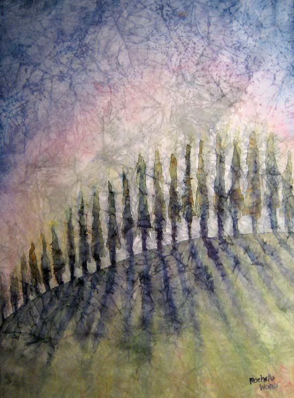
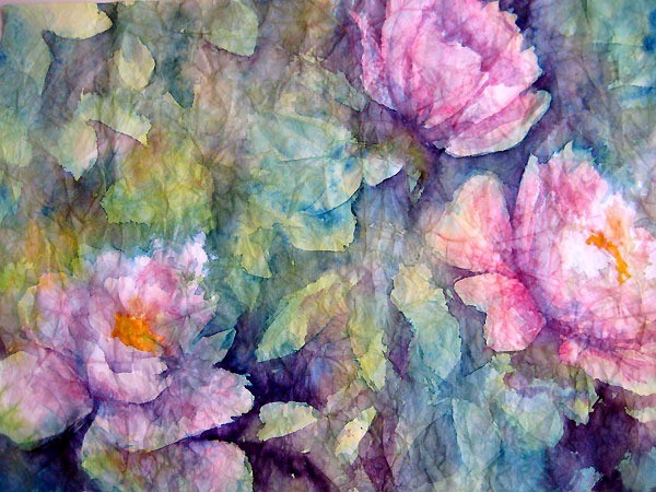
Still working on the masa crinkled paper technique - I did another in my "Row of Trees" series. I really like how this technique adds a weathered feeling to the painting, an integrated texture that seems to really enhance a landscape painting.

It's funny working with this technique as you really have to be prepared to just roll with whatever happens, more so than in standard watercolor painting. Not only does the color creep across the page as it moves in the wet, but it also runs along the lines of the crinkles.

In this case I think the effect is what I was after. I wanted to catch the feeling of early morning sun casting long shadows against a row of trees. The crinkles seem to add an emotional element to it - almost like a moment remembered from another time - a reminiscence of something pleasant you saw once.

Pictured above, "Shadows", by Rochelle Weiner - watercolor on Masa paper crinkle technique

Inspiration found outside Galter Life Center

Hustling to my exercise class the other day at Galter Life Center in Chicago, I stopped in my tracks. I was running late, only minutes to check in, whip off my street togs, shower down and jump in the pool for the class that was about to start… but yet I stopped where I was, and reached into my bag.

You never know when you will find inspiration. For me I can say what will usually inspire me – intense color and great light. This is what I found the other day, a perfect combo. Outside the gym, the daylilies were blooming and the sun was hitting at such an angle I just couldn’t walk right by without trying to capture the moment. I had to snap a few.

I wasn’t sure if I got anything good I finally downloaded today and I think these are the best of the pack. Can’t wait to try and start painting them!

Original photo - "Shadows and daylilies"

Original photo - "Shadows and daylilies"

Daylilies

Daylilies

Close up of daylily

Close up of daylily

Under the tree

Under the tree

Fall in summer

Fall in summer

Sunthroughtrees2-sm

Sun through trees series

I've been getting so many positive responses to my original "Sun through trees" based on a lesson by Karlyn Holman, that I decided to try another one. Kind of fun. The success is all in the vibrant color and the perspective of the shadows. Maybe next time I'll try it grand sized.

Pictured above, "Autumn shine", measures 11" x 15", framed original $400, framed print $150, matted print $50

Daffodilcollage-sm

Size counts

(Pictured above, "Roadside daffodils", watercolor painting, measures 22" x 30", framed original $800.)

For a long time I've been trying to "get big" with my paintings. If you're not familiar with watercolor paintings, it's kind of hard to work big.

First of all since the medium is watery, it makes it mostly impossible to work on an easel - the paint just runs right off. Ok, good for some effects but for the most part it's important to work flat. So, a big piece of paper can get unwieldy, not to mention it's difficult to keep your perspective on a large sheet lying flat in front of you. Best solution I've found so far is to start with a really good drawing which you complete upright on an easel and then when it's lying flat you just follow your drawing.

The second issue is that you have to work fast to make sure the color you put down doesn't dry before you get a chance to make sure you've had a chance to achieve the affect you planned. Trick here is to work big very wet, then put in the details in smaller manageable sections.

However - I love big paintings. The bigger the better. And I have the impression that gallery owners appreciate scale as well - the bigger the painting the higher the ticket price. All good. So - I keep trying to work bigger  - practice, practice, practice.

Following are two large scale paintings just finished this weekend.

Yellows

Title: "Yellows", watercolor painting, measures 22" x 30", framed original $800.

flying-sm

Flying dreams

I've been doing a lot of sketching lately - I have been getting inspiration to do a series based on narratives that spring from my dreams. For years now I've been having dreams of flying. Sometimes I'm in a flying contraption, sometimes I'm just floating above the street, sometimes I'm really high, sometimes I'm just above the treetops. What these dreams have in common is I'm always on my own and I'm always unseen by those below.

I've read a lot of interpretations of flying dreams but my favorite is that dreams of flying indicate reaching for higher goals. Nice.

My little sketchbook is full of quick sketches and notes of ideas for this series. I finally put one on paper, see below.

Pictured above, "Dreamflight" - watercolor on Arches 140lb paper

IMG_4127

The beauty of wrinkles

Crinkled masa paper plus watercolor provides some interesting effects.

I've done 4 paintings now, experimenting with this technique, and I have to say I'm really liking the effects you can get. The peonies pictured below turned out really soft and transparent-looking. Almost as if I'd used layers of colored tissue paper to make the image. (Hey - that's another interesting idea!)

Crinkled masa paper - Irises in a field

Crinkled masa paper - "Irises in a field"

The irises pictured above have a different feel - almost diffused, or impressionistic. For the irises I painted on the back side of the masa paper, which has a slightly fuzzy texture. This would be the explanation for the diffused effect of the painting overall.

Crinkled masa paper - Spring tulips

Crinkled masa paper - "Spring tulips"

The tulips are another idea again - the spread of color into the background gives a feeling of movement that I wasn't expecting. All in all, a fun exercise and I like the experimentation!

FinnIrises

Masa paper - the crinkle technique

Inspired by Chinese artist, Cheng-Khee Chee, I've been experimenting with the masa paper crinkle technique. It involves soaking masa paper in water and balling it up into a crinkled mass. This step breaks the sizing in the paper and when you smooth it out it's left with a network of broken crinkle lines. When you paint into it the color seeps into the cracks enhancing the delicate lines.

Row of trees - masa paper crinkle technique

Chee did a lot of paintings of woods and trees using this technique. The cracks easily translate into tiny branches and woodsy textures.

My first try became a painting which I called "Row of trees". It's a small painting, about 8" x 10". I've already sold two prints of this painting at the Galleria, so I have decided to give it another go.

I started a large painting the other day, 31" x 21" sheet of masa paper, inspired by a beautiful blue iris garden I photographed over the weekend. From what I was reading about masa paper you can either paint on the smooth, shiny side of the paper, or on the slightly fuzzy backside. For this one I decided to go with the back as I like the texture.

I started with Ultramarine Blue for the flowers, creating the initial shapes of the composition by dropping the paint right into the very wet paper. The color fanned out beautifully, running up into the newly-created crinkles in the masa paper. Painting into wet paper is one of those techniques where you have to embrace the unexpected. You can't control where the color will go - you put it where you want it and then go with the flow.  In this case I think it's a nice start.

I kept moving, adding in lots of Aureolin Yellow and Antwerp Blue in the background, in layers of uneven color to get some modulation in tone. I added some Permanent Magenta to the flowers to give them some depth, careful to leave whites where I could. Then I left it to dry. When I came back in I started adding harder edged areas of grasses and stalks, being sure to soften them here and there. I also added more ultramarine blue to the petals to start building up definition.

It's going in a good direction, but I don't think it's quite done yet. Next step is to flatten the painting. Methods I've read about include gluing the masa to a backing sheet, flattening with a brayer as I go. I like working with the lighter weight paper though, so I think I'll try dampening it and putting a warm iron to the back side and see where that gets me. Once it's flat I'll continue adding sharper details to the foreground and a bit to the midground. I think I'll leave the back row of flowers soft to enhance depth in the final composition.

Above - my cat Finnegan was having a close look, and I think he agrees it needs more work.

RO

Sign up for the mailing list.

©2024 Rochelle Weiner Carr Fine Art, All Rights Reserved