slice-sm

Sweet attack

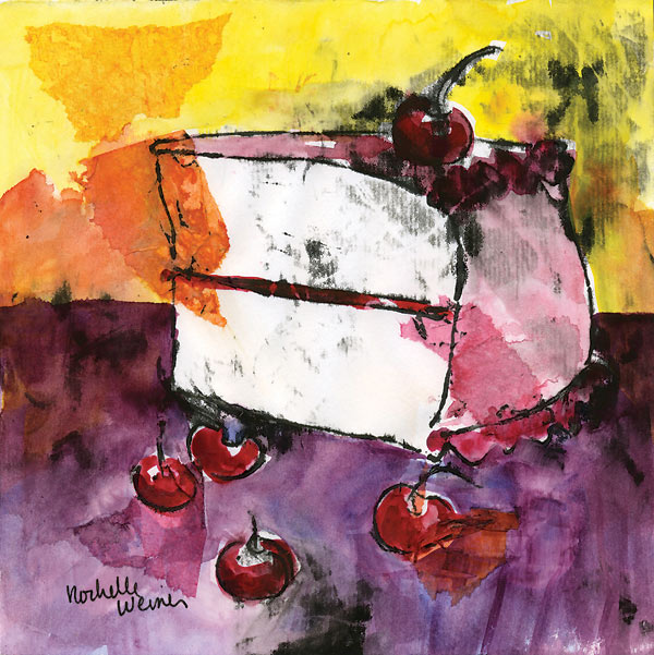
Wayne Thiebold made a name for himself during the pop art movement by painting cakes and pastries - and I can see why he chose them. They're so pretty! Like making a painting of a sculpture, it's art inspired by art.

While the Pop movement was about glorifying objects of mass culture, my inspiration is more of an homage to the work and talent that goes into making a beautiful cake or pastry.

These were way too fun to paint, and I have lots of ideas to continue the series. However, the fall out is a pretty hefty sugar craving. Uh oh!

[nggallery id=21]

Maya-sm

Pet Portraits R Us

I just finished a commissioned puppy portrait of Maya - a gorgeous Great Dane. My client purchased this painting as a birthday gift for her friend, Maya's owner. I always like to have a few paintings going at once so I'm not sitting there watching paint dry, so, while I was at it, I also did two other pet portraits. One is a portrait of Juno, a lab mix puppy owned by my good friends the Carrolls, and I also did a portrait commemorating my much missed cat, Daisy.

All three of these paintings are combinations of monoprints, collage and watercolor. I love the unexpected effect created by both the collage and the monoprint. You never know what you're going to get, but it's usually something good!

Juno-sm daisy-sm1

grapes-sm

Nuts for fruit and veg

I've been working on a series of fruit and veg for the last couple months and finished them up over the weekend. I was going for fun and funky, and certainly colorful.

These are the same technique I've used for florals in the past - a mix of monoprint, collage and watercolor that I learned from Karlyn Holman this spring. I love the element of the "happy accident" you get with the collage paper and the monoprinting process. You just never know what you're going to get!

I'm going to frame up a few of the originals as groups of two or four I think, for placement at the Galleria. And I just sent scans of all of them, and the little birdies, to get prints in time for the Sept 2 First Friday event at the Galleria. Which are your faves?

The fruits

[nggallery id=14]

The veg

[nggallery id=15]

Youlistening--sm

For the birds

I've been seeing them everywhere - birds have taken over the interiors and fashion industries in recent years. My head has been turned - so many cute little tweeters everywhere I look. So, inspired by what I'm seeing around me, I thought I'd jump in and try some monoprints with birds as the subject.

For the birds? You tell me. Below are the series finished this weekend.

Shadows-sm

Add another crinkle

Still working on the masa crinkled paper technique - I did another in my "Row of Trees" series. I really like how this technique adds a weathered feeling to the painting, an integrated texture that seems to really enhance a landscape painting.

It's funny working with this technique as you really have to be prepared to just roll with whatever happens, more so than in standard watercolor painting. Not only does the color creep across the page as it moves in the wet, but it also runs along the lines of the crinkles.

In this case I think the effect is what I was after. I wanted to catch the feeling of early morning sun casting long shadows against a row of trees. The crinkles seem to add an emotional element to it - almost like a moment remembered from another time - a reminiscence of something pleasant you saw once.

Pictured above, "Shadows", by Rochelle Weiner - watercolor on Masa paper crinkle technique

IMG_4129

Cray pas and watercolor? huh?

I had an idea last week - why not mix cray pas with watercolor? Oil and water could create unexpected and hopefully very cool results.

So, I tried drawing different images and lines on different kinds of paper and then painted watercolor on to it. The oily lines repelled the wet paint and retained the integrity of the lines. Dig it!

This concept allows for some really free design and color applications. Just getting started with the idea so the below are basically tests and experiments, but I have to say, I see endless possibilities!

[nggallery id=9]

IMG_4127

The beauty of wrinkles

Crinkled masa paper plus watercolor provides some interesting effects.

I've done 4 paintings now, experimenting with this technique, and I have to say I'm really liking the effects you can get. The peonies pictured below turned out really soft and transparent-looking. Almost as if I'd used layers of colored tissue paper to make the image. (Hey - that's another interesting idea!)

Crinkled masa paper - Irises in a field

Crinkled masa paper - "Irises in a field"

The irises pictured above have a different feel - almost diffused, or impressionistic. For the irises I painted on the back side of the masa paper, which has a slightly fuzzy texture. This would be the explanation for the diffused effect of the painting overall.

Crinkled masa paper - Spring tulips

Crinkled masa paper - "Spring tulips"

The tulips are another idea again - the spread of color into the background gives a feeling of movement that I wasn't expecting. All in all, a fun exercise and I like the experimentation!

FinnIrises

Masa paper - the crinkle technique

Inspired by Chinese artist, Cheng-Khee Chee, I've been experimenting with the masa paper crinkle technique. It involves soaking masa paper in water and balling it up into a crinkled mass. This step breaks the sizing in the paper and when you smooth it out it's left with a network of broken crinkle lines. When you paint into it the color seeps into the cracks enhancing the delicate lines.

Row of trees - masa paper crinkle technique

Chee did a lot of paintings of woods and trees using this technique. The cracks easily translate into tiny branches and woodsy textures.

My first try became a painting which I called "Row of trees". It's a small painting, about 8" x 10". I've already sold two prints of this painting at the Galleria, so I have decided to give it another go.

I started a large painting the other day, 31" x 21" sheet of masa paper, inspired by a beautiful blue iris garden I photographed over the weekend. From what I was reading about masa paper you can either paint on the smooth, shiny side of the paper, or on the slightly fuzzy backside. For this one I decided to go with the back as I like the texture.

I started with Ultramarine Blue for the flowers, creating the initial shapes of the composition by dropping the paint right into the very wet paper. The color fanned out beautifully, running up into the newly-created crinkles in the masa paper. Painting into wet paper is one of those techniques where you have to embrace the unexpected. You can't control where the color will go - you put it where you want it and then go with the flow.  In this case I think it's a nice start.

I kept moving, adding in lots of Aureolin Yellow and Antwerp Blue in the background, in layers of uneven color to get some modulation in tone. I added some Permanent Magenta to the flowers to give them some depth, careful to leave whites where I could. Then I left it to dry. When I came back in I started adding harder edged areas of grasses and stalks, being sure to soften them here and there. I also added more ultramarine blue to the petals to start building up definition.

It's going in a good direction, but I don't think it's quite done yet. Next step is to flatten the painting. Methods I've read about include gluing the masa to a backing sheet, flattening with a brayer as I go. I like working with the lighter weight paper though, so I think I'll try dampening it and putting a warm iron to the back side and see where that gets me. Once it's flat I'll continue adding sharper details to the foreground and a bit to the midground. I think I'll leave the back row of flowers soft to enhance depth in the final composition.

Above - my cat Finnegan was having a close look, and I think he agrees it needs more work.

RO

Sign up for the mailing list.

©2024 Rochelle Weiner Carr Fine Art, All Rights Reserved